

So it is no secret that I have been in a hobby slump for a long while now. There has barely been any activity on this blog for about a year and that’s due to several factors. The main factor is that I started a new job in a management role. It has been quite a journey to become proficient enough to feel comfortable in my new role.
I needed to do some internal reflection about my relationship with this hobby. I realized that I needed to recognize and respect my limits while also setting realistic expectations for myself. I was too critical of my work and in turn I would push myself to spend more hours at the hobby desk to try and fix my work. So with a new mindset in place I set out to finish my Deathwing Terminators and then work on my entries for the Capital Palette at the Nova Open.
After much deliberation I settled on doing two entries for Capital Palette. One was a project I had started last year which was the Kornak Gazarot model from Corvus Belli’s Infinity. The other project was decided on much more recently and is the Sokorentai TAG also from Corvus Belli’s Infinity. To be honest the Sokorentai has me way more jazzed up to do and large part of it is due to Minature Den’s version of the same model.

So now that I had the models settled I needed to brainstorm on the color scheme and base. Part of my new mindset is realizing that my creative process requires a lot of testing to come up with a solid plan before I ever put paint on the mini. So to start I put together a Reaper Bones IMEF Bulldog model I had won from a raffle a few years back to serve as a test model for the paints I wanted to try.
With the test model assembled and primed I started out with testing a purple color scheme. The goal was to achieve a bright and saturated color in order to make the model pop against a more desaturated background. However, despite multiple attempts I could not get that paint to be both bright and saturated. The issue I was encountering is that for purple even though I start with a very saturated base color, it quickly desaturated as I entered the highlights. Now this is a normal phenomenon with any color but seems to be particularly noticeable with purple. I would have to deviate into Magenta if I wanted to maintain saturation and that just didn’t feel right. Also, I was having some difficulty getting decent blends. In talking with my friend RedPiano, it turns out purple has a similar issue with other brighter colors where they highlights need to be done very gradually in order to get them smooth. Instead, I decided to pivot into a different color altogether which was green.
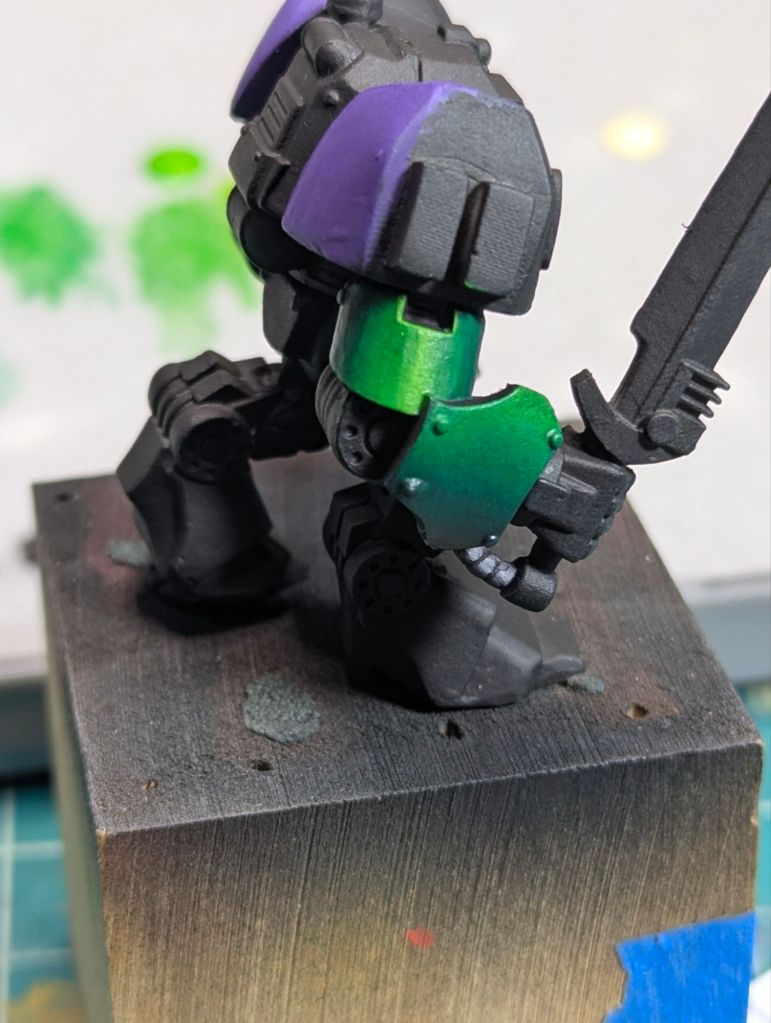
Since my main Warhammer army are the Dark Angels I had a sizeable collection of green paints to choose from. Since I wanted a saturated color scheme I went straight for some newer paints I had acquired, which were AK 3rd Gen’s Color Punch series Greenskin Punch and Slime Green. To keep up the saturation aspect I also decided to use a deep purple to mix my shadow colors and an Ice Yellow to mix my brightest highlights. Not only did these paints give me the saturation I was chasing it was also much easier for me to get decent blends compared to the purple.
With the color scheme for my main piece figured out I decided to work on the display base next. But that is a story I will save for next time as it turned out to be a metric ton of work.
